Logo Design Case Study
Whimsicle Logo/ Brand Design
LOGO CASE STUDY
As a consultant I served as the creative director for the Whimsicle Fruit Pops branding project. Here’s a look at the alternate logo options alongside a few of my thoughts.
Proof 1
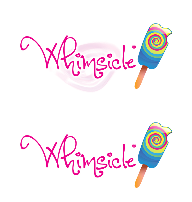
I felt that using a whimsical font would be a great start in getting on the same page as the client and would help me pick her brain a little more for the second proof. The concept behind the company is custom-made organic fruit pops. So I thought a swirl behind the text would be a good way to represent that fusion or synergy of fruit. My goals: whimsical in appearance, and a fusion of fruit or colors.

PROOF 2
The client preferred this font. So, I simplified the concept by adding a swirl to the popsicle and using less verbiage. I created two variations; one with a swirl behind the text and the other sans
PROOF 3
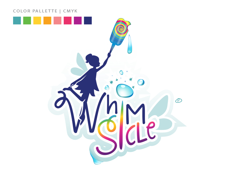
At the eleventh hour, the client felt that it wasn't fun enough, so I went back to the drawing board and re-thought the type treatment to simplify it more. Instead of the font having the whimsical feel, I drew and added a fairy/pixie character, bubbles and fruit drops as accents to finalize the lockup. The final color palette was a select spectrum of colors converted into process builds so that the logo could be printed in CMYK if necessary.
CLIENT
Whimsicle Fruit Pops
Location
Philadelphia, PA
Goals: Branding, Logo Design, Website Design